Connect with us!
Ball rolling inside circular tube Animation HTML and CSS tutorial #coding
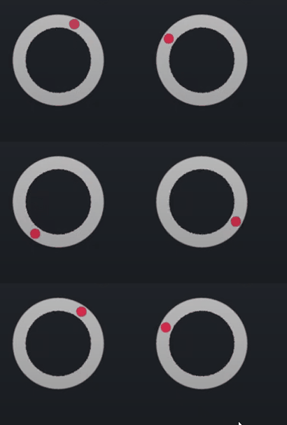
Create a ball revolving inside the tube animation using html and CSS.
Ball rolling CSS Properties
Following are the CSS properties used:
Background: The background shorthand CSS property sets all background style properties at once, such as color, image, origin and size, or repeat method.
Height: The height CSS property specifies the height of an element. By default, the property defines the height of the content area. If box-sizing is set to border-box, however, it instead determines the height of the border area.
Width: The width CSS property sets an element’s width. By default, it sets the width of the content area, but if box-sizing is set to border-box, it sets the width of the border area.
Border-radius: The border-radius CSS property rounds the corners of an element’s outer border edge. You can set a single radius to make circular corners, or two radii to make elliptical corners.
Ball rolling Code Block
Here is the code for implementing the Ball rolling inside tube Animation.
.rotating-ball {
        width: 100px;
        height: 100px;
        border-radius: 50%;
        background: radial-gradient(farthest-side, #f03355 95%, #0000) 50% 1px/12px
            12px no-repeat,
          radial-gradient(farthest-side, #0000 calc(100% - 14px), #ccc 0);

      }
Yay! We have created the static Ball rolling inside tube Animation.
Here is the output:

Ball rolling CSS Animation
Ball rolling animation can be implemented by changing transform.
Following are the classes used for animation.
The @keyframes CSS at-rule controls the intermediate steps in a CSS animation sequence by defining styles for keyframes (or waypoints) along the animation sequence. This gives more control over the intermediate steps of the animation sequence than transitions.
The transform CSS property lets you rotate, scale, skew, or translate an element. It modifies the coordinate space of the CSS visual formatting model.
Here is the CSS animation class implementing CSS.
@keyframes  rotate {
        to {
          transform: rotate(1turn);
        }
      }
The following way is to declare the CSS Class inside the class block.
 .rotating-ball {
        width: 100px;
        height: 100px;
        border-radius: 50%;
        background: radial-gradient(farthest-side, #f03355 95%, #0000) 50% 1px/12px
            12px no-repeat,
          radial-gradient(farthest-side, #0000 calc(100% - 14px), #ccc 0);
        animation: rotate 2s infinite linear;
      }
      @keyframes rotate {
        to {
          transform: rotate(1turn);
        }
      }
Following is the output for Ball rolling inside tube Animation animation.

Ball rolling Video Tutorial
You can find the complete coding tutorial in the following YouTube Short video.
Complete Code using HTML and CSS
Copy and paste the complete code in Visual studio code to view the output.
<!DOCTYPE html>
<html lang="en">
  <head>
    <style>
      .rotating-ball {
        width: 100px;
        height: 100px;
        border-radius: 50%;
        background: radial-gradient(farthest-side, #f03355 95%, #0000) 50% 1px/12px
            12px no-repeat,
          radial-gradient(farthest-side, #0000 calc(100% - 14px), #ccc 0);
        animation: rotate 2s infinite linear;
      }
      @keyframes rotate {
        to {
          transform: rotate(1turn);
        }
      }
    </style>
    <title>Salow Studios</title>
  </head>
  <body>
    <h1>Rotating Ball Animation</h1>
    <div class="rotating-ball"></div>
  </body>
</html>
Thank you for reading this article. I hope that it helps you creating your own Ball rolling inside tube Animation Animation using CSS and HTML. See you in next tutorial!


