Connect with us!
Creating a Mesmerizing Sine Wave Animation with HTML, CSS, and JavaScript
In the world of web development, animations can bring life to your website and engage users in unique ways. Today, we’re going to create a captivating sine wave animation using HTML, CSS, and JavaScript. This tutorial is perfect for both beginners looking to expand their skills and experienced developers seeking a quick, impressive project.
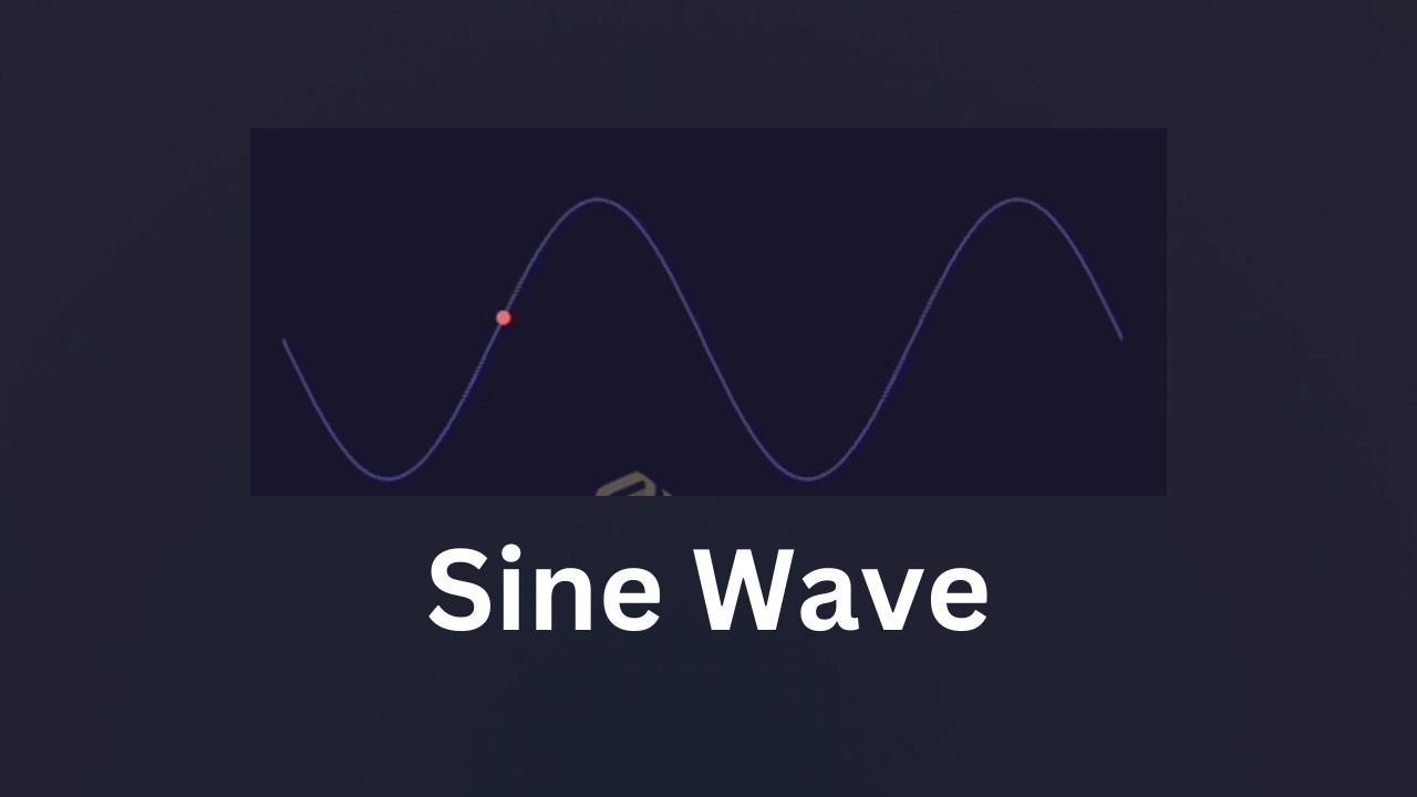
What is a Sine Wave?
Before we dive into the code, let’s briefly discuss what a sine wave is. In mathematics, a sine wave is a smooth, periodic oscillation that repeats at regular intervals. It’s commonly found in natural phenomena like sound waves and alternating current.
Video Tutorial
Before we dive into the written explanation, check out this video tutorial that walks you through the process:
Setting Up the HTML
Let’s start with the HTML structure:
<!DOCTYPE html>
<html lang="en">
<head>
    <title>Salow Studios</title>
</head>
<body style="background: #19182f;">
    <h1 style="color: aliceblue;margin-left: 30px;">Sine Wave animation</h1>
    <div class="wave-container">
        <svg width="350" height="170" viewBox="0 0 600 300">
            <path id="sinePath" class="sine-wave" d=""/>
            <circle class="dot" r="5" style="offset-path: path(''); offset-rotate: 0deg;"/>
        </svg>
    </div>
</body>
</html>
This code sets up the basic structure of our webpage. We’re using an SVG (Scalable Vector Graphics) element to create our sine wave and the moving dot. The viewBox attribute allows us to define a coordinate system that’s different from the actual size of the SVG, giving us more flexibility in our design.
If you’re new to HTML or need a refresher, check out our Complete HTML Tutorial – How to Make a Easy Simple Website.
Styling with CSS
Next, let’s add some style to our animation:
<style>
    .wave-container {
        margin: 0;
        display: flex;
        align-items: center;
        overflow: hidden;
    }
    .sine-wave {
        stroke: #4a4a8f;
        stroke-width: 2;
        fill: none;
    }
    .dot {
        fill: #ff6b6b;
        animation: moveDot 4s linear infinite;
    }
    @keyframes moveDot {
        0% {
            offset-distance: 0%;
        }
        100% {
            offset-distance: 100%;
        }
    }
</style>
Here’s what each part does:
- We style the container to center its contents and hide any overflow.
- The sine wave path is given a color (
#4a4a8f) and width. - The dot is colored (
#ff6b6b) and animated using themoveDotkeyframes. - The
@keyframesrule defines the animation, moving the dot along the path from start to end.
The offset-distance property is part of the CSS Motion Path Module, which allows us to animate elements along a path.
For more advanced CSS techniques, including animations, check out our tutorials on Creating a 3D Cube Loader with HTML and CSS and Mastering Font Styling in CSS.
Bringing it to Life with JavaScript
Finally, let’s use JavaScript to generate our sine wave path:
<script>
    function createSinePath() {
        const width = 600;
        const height = 300;
        const amplitude = 100;
        const frequency = 2;
        let path = `M 0 ${height/2}`;
        for (let x = 0; x <= width; x++) {
            const y = amplitude * Math.sin((x / width) * Math.PI * 2 * frequency) + height/2;
            path += ` L ${x} ${y}`;
        }
        return path;
    }
    const sinePath = document.getElementById('sinePath');
    const dot = document.querySelector('.dot');
    const pathData = createSinePath();
    sinePath.setAttribute('d', pathData);
    dot.style.offsetPath = `path('${pathData}')`;
</script>
Let’s break this down:
- The
createSinePathfunction generates the SVG path data for our sine wave. - We use a loop to calculate points along the sine wave, using the
Math.sinfunction. - The resulting path is a series of line commands (
L) that create our smooth curve. - We then set this path data to both the SVG path element and the dot’s
offsetPathstyle property.
If you’re new to JavaScript or need to brush up on your skills, our Java For Loops: A Comprehensive Guide can help you understand the looping concept used here (although it’s for Java, the principle is similar in JavaScript).
Conclusion
And there you have it! A beautiful, mesmerizing sine wave animation created with HTML, CSS, and JavaScript. This project demonstrates the power of combining these technologies to create engaging visual effects.
You can further customize this animation by adjusting the amplitude, frequency, or colors to fit your website’s design. For more advanced projects, consider exploring D3.js for data visualization or Three.js for 3D animations.
Remember, animations can significantly enhance user experience, but they should be used judiciously. Always consider web accessibility when adding animations to your site.
For more creative CSS animations, check out our tutorials on Creating Dynamic Toast Notifications with HTML and CSS and Neon Text Glow Effect Using HTML and CSS.
Happy coding, and may your websites be ever engaging!
This tutorial was brought to you by Salow Studios. For more web development tips and tricks, check out our YouTube channel and follow us on Twitter. If you’re interested in exploring more advanced topics, take a look at our guide on Running GGUF Models with Transformers and Other Libraries.