Connect with us!
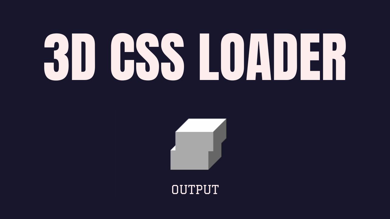
Creating a 3D Cube Loader with HTML and CSS: A Step-by-Step Guide
Animations can bring your website to life, providing a dynamic user experience that captures attention. In this article, we’ll walk you through creating a 3D Cube Loader using HTML and CSS, breaking down the code line by line. This loader is perfect for adding a modern touch to your web projects.
Watch the 3D Cube Loader in Action
Before diving into the code, check out this short video demonstration to see the 3D Cube Loader in action.
HTML and CSS Breakdown
Let’s dive into the code that makes this loader possible.
<!DOCTYPE html>
<html lang="en">
<head>
    <style>
        .cube-loader {
            --s: 75px;
            --_d: calc(0.353*var(--s));
            width: calc(var(--s) + var(--_d));
            aspect-ratio: 1;
            display: grid;
            margin-left: 100px;
        }
        .cube-loader:before,
        .cube-loader:after {
            content:"";
            clip-path:polygon(var(--_d) 0,100% 0,100% calc(100% - var(--_d)),calc(100% - var(--_d)) 100%,0 100%,0 var(--_d));
            background:
                conic-gradient(from -90deg at var(--s) var(--_d),
                #fff 135deg,#666 0 270deg,#aaa 0);
            animation: cubeMove 1.2s infinite;
        }
        .cube-loader:before {
            z-index: 1;
            margin-bottom: calc(var(--_d)/-2 - 1px);
        }
        .cube-loader:after {
            margin-top: calc(var(--_d)/-2 - 1px);
            animation-delay: 0.6s;
        }
        @keyframes cubeMove {
            0%     {transform: translate(0);}
            16.67% {transform: translate(-10px);}
            33.33% {transform: translate(10px);}
            50%,
            100%   {transform: translate(0);}
        }
    </style>
    <title>Salow Studios</title>
</head>

<body style="background: #19182f;">
    <h1 style="color: aliceblue;margin-left: 30px;">3D Cube Animation</h1>
    <div class="cube-loader"></div>
</body>
</html>
Line-by-Line Explanation
The Basic Structure
<!DOCTYPE html>
<html lang="en">
This line declares the document type and sets the language of the HTML document to English.
Styling the Loader
.cube-loader {
    --s: 75px;
    --_d: calc(0.353*var(--s));
    width: calc(var(--s) + var(--_d));
    aspect-ratio: 1;
    display: grid;
    margin-left: 100px;
}
--s: 75px;: This CSS variable sets the size of the cube.--_d: calc(0.353*var(--s));: This calculates the diagonal offset, a key factor in achieving the 3D effect.width: calc(var(--s) + var(--_d));: The width is dynamically calculated using the size and diagonal offset.aspect-ratio: 1;: Ensures the loader stays square by maintaining a 1:1 aspect ratio.display: grid;: Aligns the elements within the loader.margin-left: 100px;: Adds spacing to position the loader properly on the page.
If you’re interested in more advanced techniques for styling web elements, check out our Login Page GTA 5 Style article.
Creating the 3D Effect
.cube-loader:before,
.cube-loader:after {
    content:"";
    clip-path: polygon(var(--_d) 0,100% 0,100% calc(100% - var(--_d)),calc(100% - var(--_d)) 100%,0 100%,0 var(--_d));
    background: conic-gradient(from -90deg at var(--s) var(--_d), #fff 135deg,#666 0 270deg,#aaa 0);
    animation: cubeMove 1.2s infinite;
}
content: "";: Ensures the pseudo-elements are displayed.clip-path: polygon(...);: Defines the polygon shape, which contributes to the 3D cube appearance.background: conic-gradient(...);: The gradient adds shading, simulating the cube’s depth.animation: cubeMove 1.2s infinite;: Applies thecubeMoveanimation, making the cube appear to rotate.
For more CSS animations, our 3D Ball Bounce Animation Tutorial is a great place to start.
Layering and Animation Timing
.cube-loader:before {
    z-index: 1;
    margin-bottom: calc(var(--_d)/-2 - 1px);
}
.cube-loader:after {
    margin-top: calc(var(--_d)/-2 - 1px);
    animation-delay: 0.6s;
}
z-index: 1;: Ensures the:beforeelement is on top of the:afterelement.margin-bottom: calc(...);: Aligns the:beforeelement.animation-delay: 0.6s;: Delays the start of the:afteranimation, creating a staggered effect.
To explore more complex timing and layering in animations, you can read about Running GGUF Models with Transformers.
Keyframe Animation
@keyframes cubeMove {
    0%     {transform: translate(0);}
    16.67% {transform: translate(-10px);}
    33.33% {transform: translate(10px);}
    50%,
    100%   {transform: translate(0);}
}
@keyframes cubeMove: Defines the movement of the cube in a cyclical pattern.transform: translate(...);: Controls the position of the cube at different stages of the animation.
If you’re interested in how animations can be used to enhance user interfaces, our guide on Ensuring Complete Responses from OpenAI API offers some insights.
Conclusion
This 3D Cube Loader is a simple yet effective way to add a touch of modern design to your web projects. By understanding each part of the code, you can easily customize and expand upon this example to fit your specific needs. For more tutorials and coding tips, be sure to explore the wide array of resources available on Salow Studios.