Connect with us!
Creating Dynamic Toast Notifications with HTML and CSS: A Step-by-Step Guide
Introduction
Toast notifications are a staple in modern web design, providing users with quick, non-intrusive messages that enhance the user experience. In this guide, we’ll walk you through how to create dynamic and stylish toast notifications using HTML and CSS. Whether you’re looking to display success messages, warnings, or errors, this tutorial will have you covered.
Source Code
- This code was inspired from the CodePen
- GitHub Source code – Star the project for future updates – GitHub Link
- Live Demo of the website – Click Here
Video Explanation
Check out the YouTube explanation of the Dynamic Toast Notifications
Setting Up Your HTML Structure
Let’s start with the basic HTML layout for our toast notifications.
<!DOCTYPE html>
<html lang="en">
<head>
<meta charset="UTF-8">
<meta name="viewport" content="width=device-width, initial-scale=1.0">
<link rel="stylesheet" href="styles.css" />
<title>Salow Studios | Toast Animation</title>
</head>
<body>
<input type="checkbox" name="t-help" id="t-help" checked>
<input type="checkbox" name="t-success" id="t-success" checked>
<input type="checkbox" name="t-warning" id="t-warning" checked>
<input type="checkbox" name="t-error" id="t-error" checked>
<div class="toast-panel">
<div class="toast-item help">
<div class="toast help">
<label for="t-help" class="close"></label>
<h3>Help!</h3>
<p>Do you have a problem? Just use this <a href="#">contact form</a>.</p>
</div>
</div>
<div class="toast-item success">
<div class="toast success">
<label for="t-success" class="close"></label>
<h3>Success!</h3>
<p>Your message has been sent successfully.</p>
</div>
</div>
<div class="toast-item warning">
<div class="toast warning">
<label for="t-warning" class="close"></label>
<h3>Warning!</h3>
<p>Sorry, there was a problem with your request.</p>
</div>
</div>
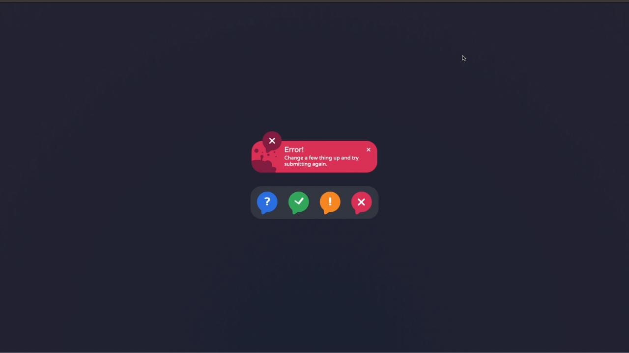
<div class="toast-item error">
<div class="toast error">
<label for="t-error" class="close"></label>
<h3>Error!</h3>
<p>Change a few things up and try submitting again.</p>
</div>
</div>
<div class="toast-icons">
<label for="t-help" class="toast-icon icon-help"></label>
<label for="t-success" class="toast-icon icon-success"></label>
<label for="t-warning" class="toast-icon icon-warning"></label>
<label for="t-error" class="toast-icon icon-error"></label>
</div>
</div>
</body>
</html>Breaking Down the HTML
- DOCTYPE Declaration & Language: We start with the
<!DOCTYPE html>declaration to ensure the document is recognized as HTML5. Thelang="en"attribute in the<html>tag sets the language to English, improving accessibility and SEO. - Meta Tags: The
<meta charset="UTF-8">tag ensures that your page uses UTF-8 encoding, which supports special characters. The<meta name="viewport" content="width=device-width, initial-scale=1.0">tag is crucial for making your page responsive, adapting its layout based on the device’s screen size. Learn more about responsive design in our Creating a 3D Cube Loader with HTML and CSS article. - Title: The
<title>tag is vital for SEO, as it defines the title of your page, which appears in search engine results and browser tabs. - Linking CSS: The
<link rel="stylesheet" href="styles.css" />tag links to your external CSS file, ensuring your styles are applied across the page. - Checkboxes for Control: The hidden checkbox inputs control which toast notifications are displayed. Each checkbox is linked to a corresponding toast message via the
idattribute. Checkboxes are a simple yet effective way to manage the visibility of elements without JavaScript. Check out our article on Login Page GTA 5 Style for more tips on using HTML elements creatively. - Toast Panel & Toast Items: The
toast-paneldiv contains all the toast notifications. Eachtoast-itemdiv represents a different notification type (help, success, warning, error). Inside each item, there’s a close button, a heading (<h3>), and a message (<p>). Structuring your HTML like this ensures that your content is organized and easy to style.

Styling Your Toast Notifications with CSS
Next, let’s dive into the CSS that brings these toast notifications to life.
@import url('https://fonts.googleapis.com/css2?family=Varela+Round&display=swap');Custom Font: We’re importing the “Varela Round” font from Google Fonts. This font adds a modern, friendly touch to your notifications. Using custom fonts can enhance the user experience significantly. For more on styling with fonts, explore our Mastering Font Styling guide.
:root {
    --tr: all 0.5s ease 0s;
    --ch1: #05478a;
    --ch2: #0070e0;
    --cs1: #005e38;
    --cs2: #03a65a;
    --cw1: #c24914;
    --cw2: #fc8621;
    --ce1: #851d41;
    --ce2: #db3056;
}
CSS Variables: These variables (:root) allow you to store colors and transitions for easy reuse throughout your stylesheet. This makes it simple to adjust the theme or tweak the design later.
body {
    margin: 0;
    padding: 0;
    width: 100vw;
    height: 100vh;
    overflow: hidden;
    display: flex;
    align-items: center;
    justify-content: flex-end;
    flex-direction: column;
    background: radial-gradient(circle at 50% 100%, #1d2232, #262434);
    font-family: "Varela Round", sans-serif;
}
Global Body Styles: Here, we set the body to fill the entire viewport (width: 100vw; height: 100vh;) and use Flexbox to center our content. The background uses a radial gradient to add depth and style. Flexbox is a powerful layout tool that you can learn more about in our Responsive Login Page guide.
.toast-panel {
    display: flex;
    flex-direction: column;
    align-items: center;
    justify-content: center;
    transition: var(--tr);
    position: absolute;
    padding: 0 1rem;
    height: 100%;
    min-height: 20rem;
    min-width: 375px;
}
Toast Panel Styles: The .toast-panel class styles the container for all toast notifications, using Flexbox again to align and center the items. The position: absolute; ensures that the panel is placed exactly where we want it, floating above other content. For more on positioning elements, visit our Lightsaber Build tutorial.
.toast-item {
    overflow: hidden;
    max-height: 25rem;
    transition: var(--tr);
    animation: show-toast 4s ease 3s 1;
}
Toast Item Styles: Each .toast-item is styled to ensure content doesn’t overflow its boundaries. The animation property makes the toast appear smoothly on the screen. Learn more about using animations effectively in our Neon Text Glow Effect guide.
@keyframes show-toast {
    0%, 50%, 100% { max-height: 0; opacity: 0; }
    10%, 25% { max-height: 15rem; opacity: 1; }
}
Keyframes for Animation: The @keyframes rule defines the animation for showing the toast notifications. It controls the visibility and height of the notifications, making them appear and disappear smoothly. For more on animations and keyframes, check out our 3D Ball Bounce Animation Tutorial.
.toast {
    background-color: #232b2b;
    background: var(--bg);
    color: #f5f5f5;
    padding: 1rem 2rem

 1rem 6rem;
    text-align: center;
    border-radius: 2rem;
    position: relative;
    font-weight: 300;
    margin: 1.75rem 0 1rem;
    text-align: left;
    max-width: 15rem;
    transition: var(--tr);
    opacity: 1;
}
Styling the Toast Notifications: This block sets the appearance of the toast messages. It includes padding, text alignment, border-radius for rounded corners, and a transition for smooth visibility changes. Using such styles ensures your design is clean and modern, which you can see in our Google Symbol Design article.
.toast:before {
    content: "";
    position: absolute;
    width: 5.5rem;
    height: 6rem;
    --drop:
        radial-gradient(circle at 64% 51%, var(--clr) 0.45rem, #fff0 calc(0.45rem + 1px)),
        radial-gradient(circle at 100% 100%, #fff0 0.9rem, var(--clr) calc(0.9rem + 1px) 1.25rem, #fff0 calc(1.25rem + 1px) 100%),
        radial-gradient(circle at 0% 0%, #fff0 0.9rem, var(--clr) calc(0.9rem + 1px) 1.25rem, #fff0 calc(1.25rem + 1px) 100%),
        radial-gradient(circle at 0% 120%, var(--clr) 4rem, #fff0 calc(4rem + 1px));
    background:
        radial-gradient(circle at 22% 3.8rem, var(--clr) 0.75rem, #fff0 calc(0.75rem + 1px)),
        radial-gradient(circle at 95% 1.9rem, var(--clr) 0.07rem, #fff0 calc(0.07rem + 1px)),
        radial-gradient(circle at 80% 2.25rem, var(--clr) 0.18rem,
        radial-gradient(circle at 80% 75%, var(--clr) 0.35rem, #fff0 calc(0.35rem + 1px)),
        radial-gradient(circle at 43% 2.3rem, var(--clr) 0.07rem, #fff0 calc(0.07rem + 1px)),
        radial-gradient(circle at 40% 1rem, var(--clr) 0.12rem, #fff0 calc(0.12rem + 1px)),
        radial-gradient(circle at 20% 1.5rem, var(--clr) 0.25rem, #fff0 calc(0.25rem + 1px)),
        var(--drop),
        #f000;
    background-repeat: no-repeat;
    background-size: 100% 100%, 100% 100%, 100% 100%, 100% 100%, 100% 100%, 100% 100%, 100% 100%, 100% 100%, 1.625rem 1.625rem, 1.625rem 1.625rem, 100% 100%, 100% 100%;
    background-position: 0 0, 0 0, 0 0, 0 0, 0 0, 0 0, 0 0, 0 0, calc(100% - 1.75rem) 2.85rem, calc(100% - 1.75rem) 2.95rem, 0 0, 0 0;
    bottom: 0rem;
    left: 0rem;
    z-index: 0;
    border-radius: 0 0 0 2rem;
}
Background Effects for Toasts: This advanced CSS uses gradients and positioning to create a background effect for the toast notifications. These effects add depth and a polished look to the design. To dive deeper into CSS effects, read our Emoji Smiley Face Tutorial.

Final Thoughts
By following this guide, you’ll have dynamic, visually appealing toast notifications that enhance your website’s user experience. For more tips and tutorials on HTML, CSS, and web development, be sure to explore the rest of our articles at Salow Studios.