Connect with us!

Instagram Heart Tutorial HTML and CSS Coding
CSS is a style sheet language which can help you to style your own webpage. We are all familiar with the various social media platforms like Instagram and TikTok and have you wondered how they create the like button.
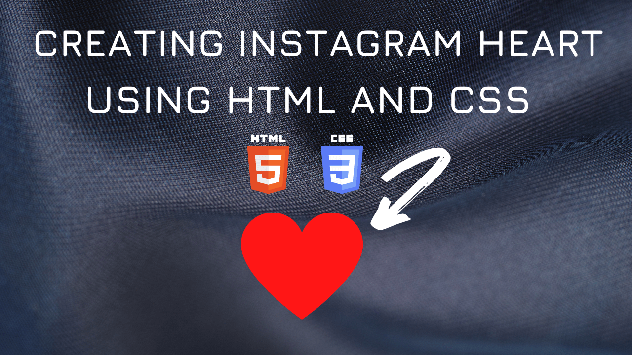
In this article we will see how to program in css to create a heart.
The most important properties that we use to create the heart element are:
Position is a common property which helps us to specify the type of positioning method used for an element.
Background is also a common property which is used to specify the background of an element.
Transform very useful property which applies a 2D or 3D transformation to an element. This property allows you to rotate, scale, move and skew elements.
Transform-origin property allows you to change the position of the transformed elements.
Here is the CSS class for implementing it.
Table of Contents
Instagram Heart Code Block
.heart {
    position: relative;
    width: 100px;
    height: 90px;
}
.heart:before,
.heart:after {
    position: absolute;
    content: "";
    left: 50px;
    width: 50px;
    height: 80px;
    background: red;
    border-radius: 50px 50px 0 0;
    transform: rotate(-45deg);
    transform-origin: 0 100%;
}
.heart:after {
    left: 0;
    transform: rotate(45deg);
    transform-origin: 100% 100%;
}
Yay! We have created a heart using CSS. Its very simple to use the class above and create this element.
Here is the output:

You can find the complete coding tutorial in the following Youtube video.
Video Tutorial for Creating Heart
Here is the complete code of HTML and CSS for creating Heart
<!DOCTYPE html>
<html lang="en">
  <head>
    <style>
      .heart {
        position: relative;
        width: 100px;
        height: 90px;
      }
      .heart:before,
      .heart:after {
        position: absolute;
        content: "";
        left: 50px;
        width: 50px;
        height: 80px;
        background: red;
        border-radius: 50px 50px 0 0;
        transform: rotate(-45deg);
        transform-origin: 0 100%;
      }
      .heart:after {
        left: 0;
        transform: rotate(45deg);
        transform-origin: 100% 100%;
      }
    </style>
    <title>Salow Studios</title>
  </head>
  <body>
    <h1>Icon Design</h1>
    <div class="heart"></div>
  </body>
</html>
Thank you for reading this article. I hope that it helps you creating your own heart using CSS and HTML. Good luck and happy coding !


