Connect with us!
☯️ Yin Yang CSS Spin animation HTML5 CSS3
The yin-yang theory states that all things in the universe are governed by opposing, yet interdependent forces. Yin represents the passive and yang represents the active. One can find many ways to describe these opposing forces like night and day, or cold and hot.
Yin Yang is a Chinese traditional symbol. It is a concept of dualism, In this tutorial we will be designing Yin Yang using CSS and HTML. You this to implement Ying Yang in your website
Following is the CSS Class for Yin Yang Symbol.
.yin-yang {
width: 96px;
height: 48px;
background: white;
border-color: black;
position: relative;
border-style: solid;
border-width: 2px 2px 50px 2px;
border-radius: 100%;
}
.yin-yang:before {
content: "";
background: white;
border: 18px solid black;
position: absolute;
top: 50%;
left: 0;
border-radius: 100%;
width: 12px;
height: 12px;
}
.yin-yang:after {
content: "";
background: black;
border: 18px solid white;
position: absolute;
top: 50%;
left: 50%;
border-radius: 100%;
width: 12px;
height: 12px;
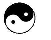
}The above code creates a static output:

The following code is to add animation to the Yin Yang symbol. We will try to spin the symbol. We rotate the Symbol to 360 degrees thus creating the spinning effect
@keyframes spin {
        100% {
          -webkit-transform: rotate(360deg);
          transform: rotate(360deg);
        }
      }
Below is the spinning animation of Yin Yang.
You can find the complete coding in Visual Studio Code tutorial in the following YouTube Video.
Here is the complete code for creating Yin Yang Symbol with CSS animation using HTML and CSS:
<!DOCTYPE html>
<html lang="en">
  <head>
    <style>
      .yin-yang {
        width: 96px;
        height: 48px;
        background: white;
        border-color: black;
        position: relative;
        border-style: solid;
        border-width: 2px 2px 50px 2px;
        border-radius: 100%;
        animation: spin 8s linear infinite;
      }
      .yin-yang:before {
        content: "";
        background: white;
        border: 18px solid black;
        position: absolute;
        top: 50%;
        left: 0;
        border-radius: 100%;
        width: 12px;
        height: 12px;
      }
      .yin-yang:after {
        content: "";
        background: black;
        border: 18px solid white;
        position: absolute;
        top: 50%;
        left: 50%;
        border-radius: 100%;
        width: 12px;
        height: 12px;
      }
      @keyframes spin {
        100% {
          -webkit-transform: rotate(360deg);
          transform: rotate(360deg);
        }
      }
    </style>
    <title>Salow Studios</title>
  </head>
  <body>
    <h1 class="h1">Yin Yang Symbol</h1>
    <div class="yin-yang"></div>
  </body>
</html>
Thank you for reading. I hope that it has helped you with your project. Good luck and happy coding!
See you in another tutorial!